Amazon Web Services • F1
Data Visualisation • Storyboarding
Challenge
To create an Analysis Presentation concept for a Formula One driver, outlining key stats and data. The target audience would be Formula One fans who are interested in deep insights into races and drivers.
Research
To begin with I looked at UI concepts of player stats from apps and different ways of visualising data. I used these concepts as design inspirations, looking at how I could use player stats in an engaging, fun and informative way.
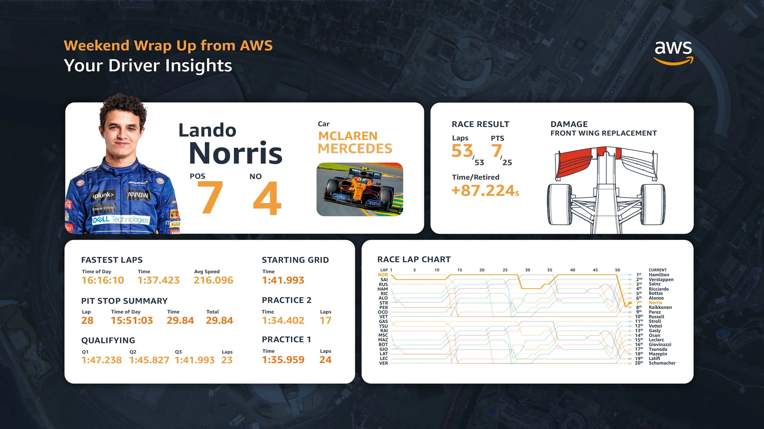
Concept 1
For my first attempt, I split the information into four sections, information about the driver, details about the car and insights into the race. I have tried to make the information easily retainable and engaging.
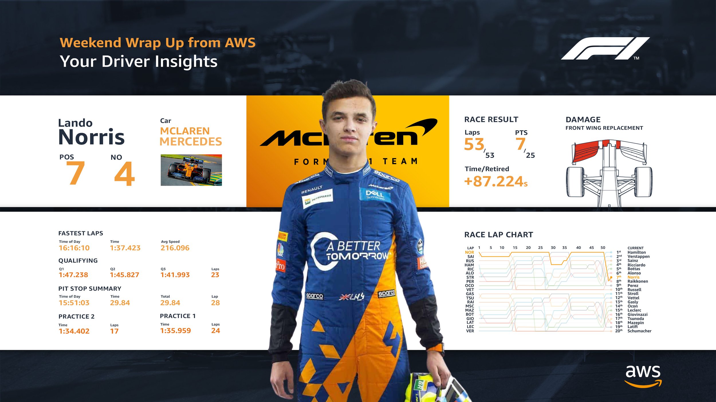
Concept 2
After speaking with Client Services we agreed that having all information in one area instead of separated would be easier to read. I also made the driver more prominent as they are the main focus of the information.
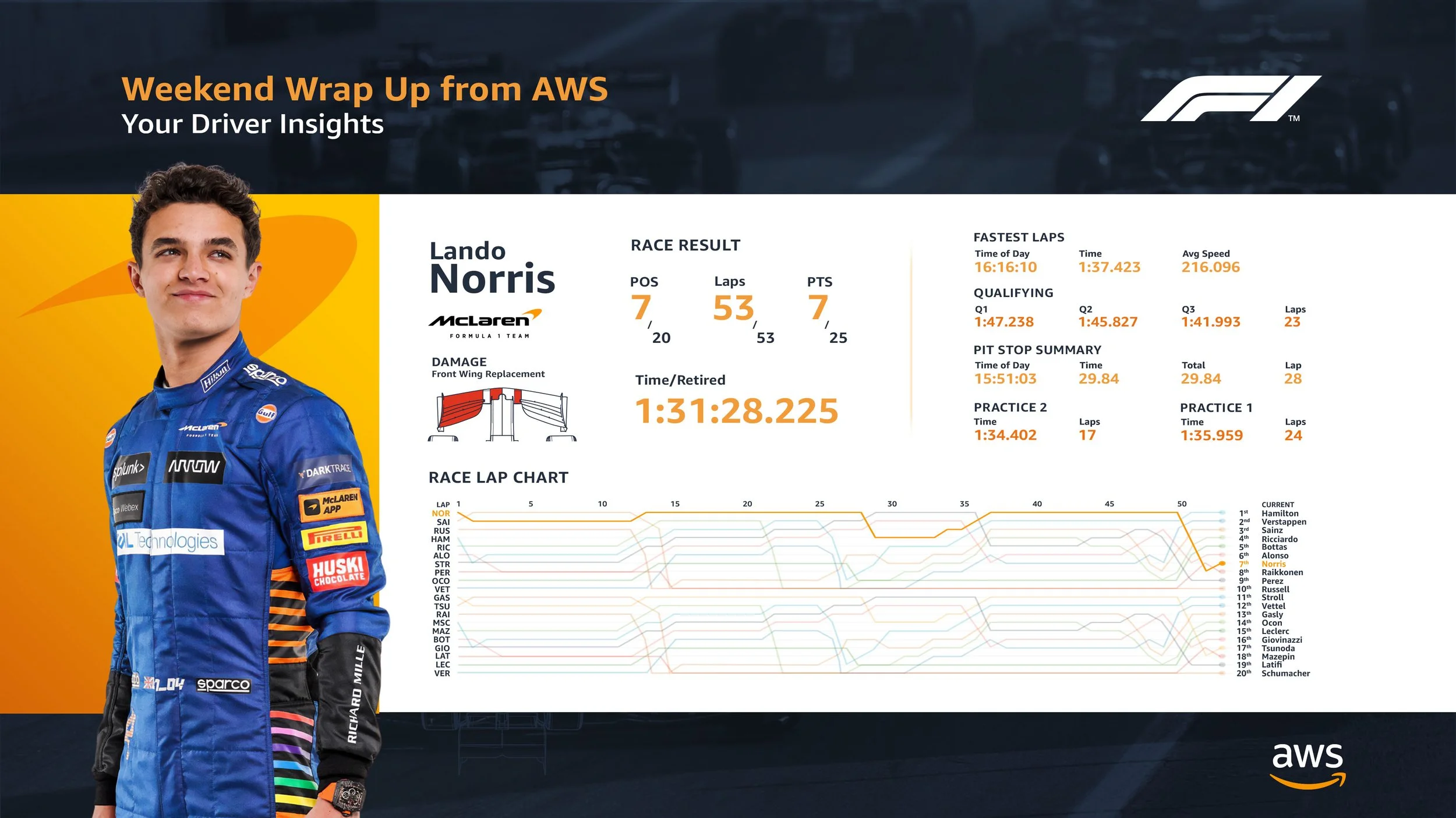
Concept 3
In this version, I have moved the driver to the left so that the stats and information can be read more easily. I have also made the Race Lap Chart larger as this is the main focus of the stats.
Brief
Creation of a simple storyboard comparing an Amazon delivery driver’s journey to an F1 driver in a race (side-by-side from driver POV).
Storyboard

Lando Norris: On the starting grid, about to start
Amazon Driver: Just finished loading up his deliveries, about to start their shift
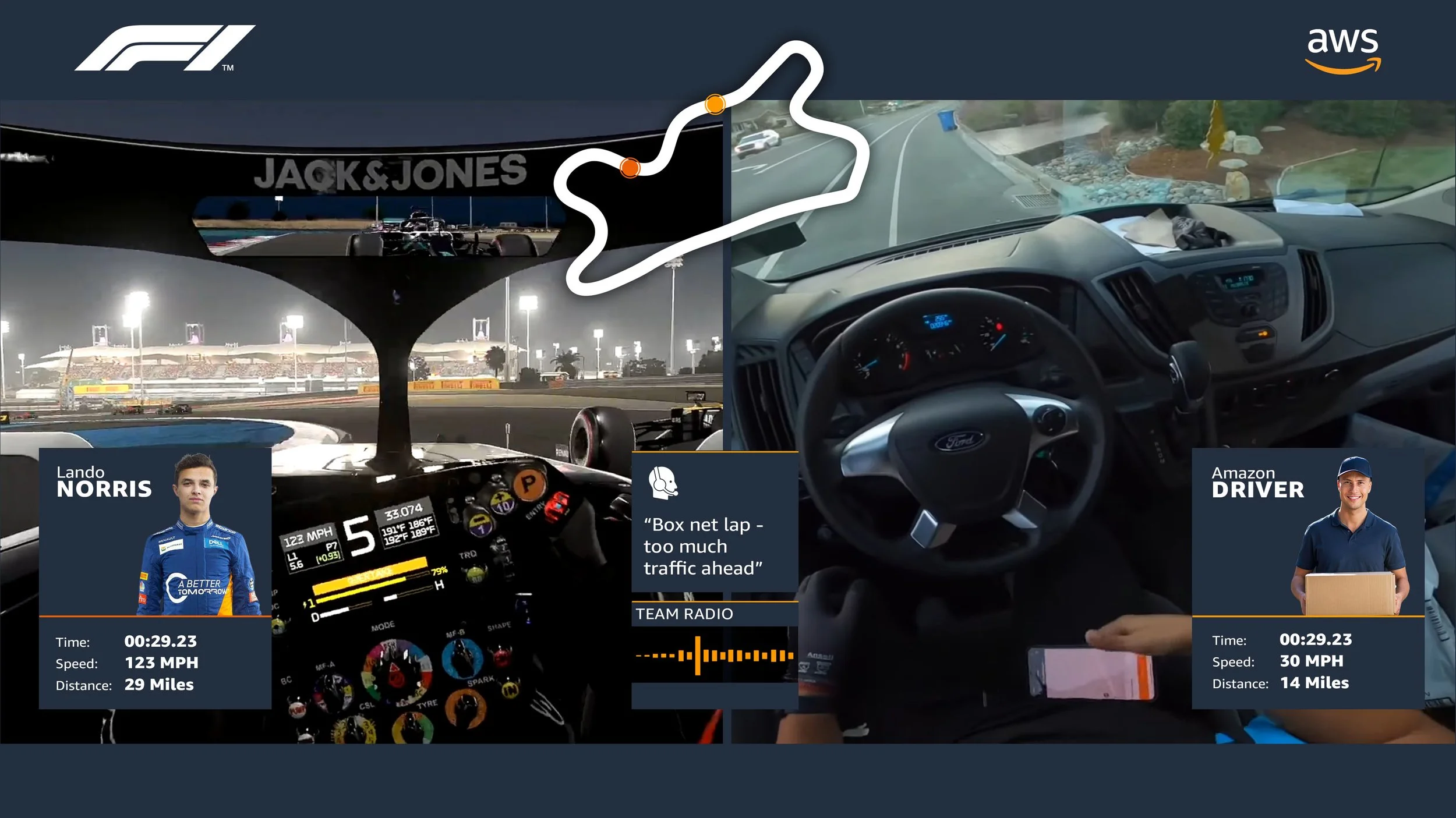
Lando Norris: In the middle of a race gets a call from the team about strategy change
Amazon Driver: Satnav reroutes due to traffic jam ahead
“Box next lap - too much traffic ahead”
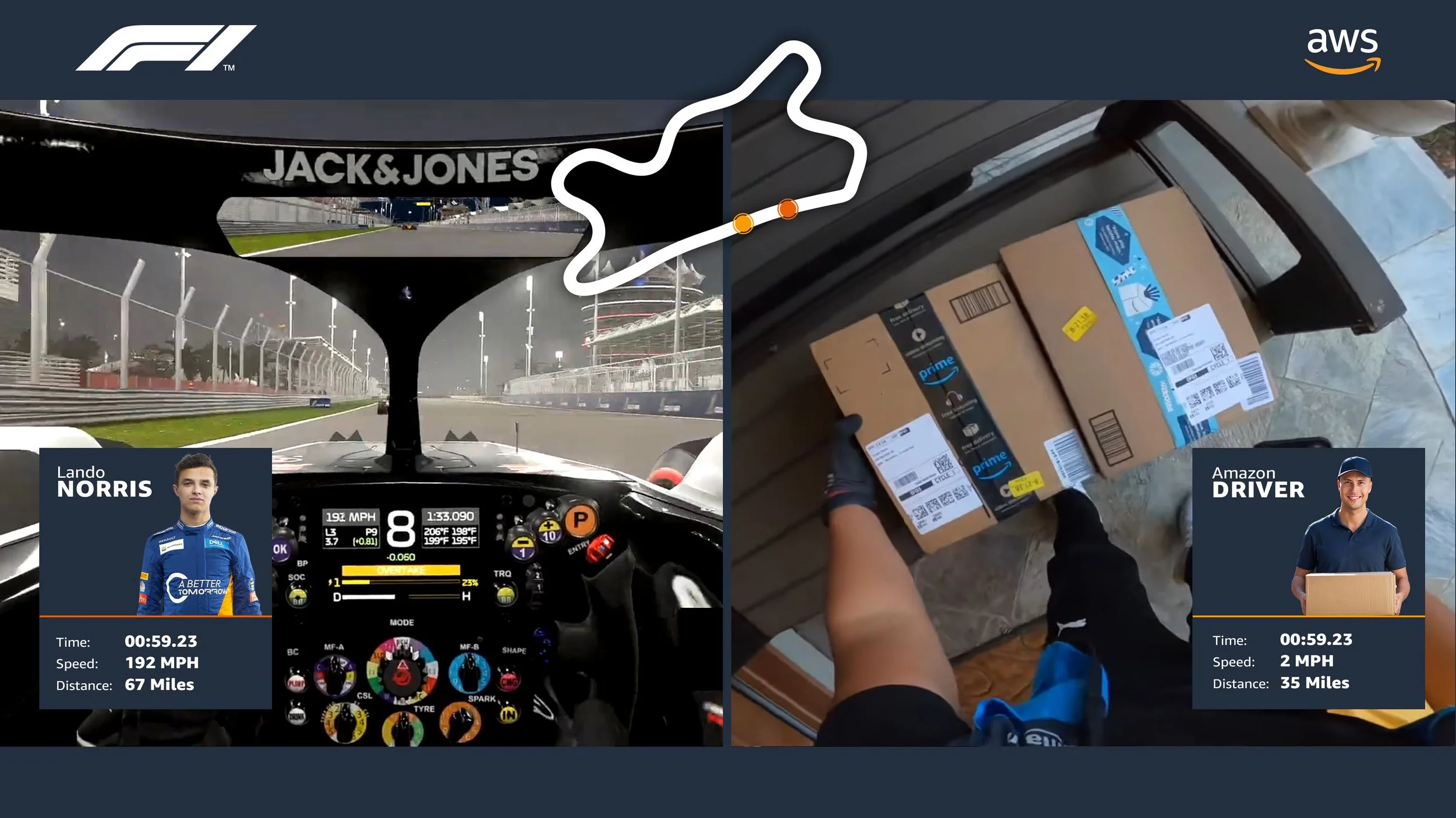
Lando Norris: Completes his race in record time
Amazon Driver: Finishes their delivery in record time